Every day, more and more people decide to take the next step and become their own bosses. Life brings all sorts of opportunities and we are the ones in charge of reading them accurately in order to take advantage. But most importantly, when starting a new project or business, you must project your ideas and goals to the rest. This is why, building a cool, striking and eye-catching business sign is so important.
In order to ensure the success of any project, business, product or service, it is essential to display and convey it effectively. However, marketings fast and volatile pace makes it is quite difficult to keep up with its changing rhythm. Therefore, at Summit Customs, we put together some of the most common mistakes business owners make when designing their commercial signs.
Setting location
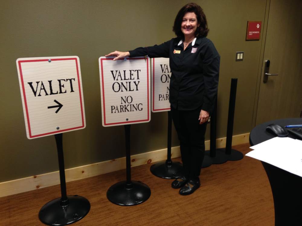
 One of the very first aspects to consider is, where your signage is going to be placed. Think whether you need an outdoor or indoor sign. Also, its location could help to determine its size, shape, font, style, colors, materials, and if it needs illumination or not. For example, people often fail to consider drivers and a sign installed near a road, if it needs to be big and readable, otherwise, drivers won’t be able to notice it from a distance.
Complicated designs
After decades working in the signage market, at Summit Customs, we have noticed that younger business owners tend to make more complex designs. Some might be really cool and functional, but we suggest, especially for starters, to go for simple designs. Business signage should be eye-catching, but readable. Therefore, simplicity in the design is better. When designing, try to keep in mind your brand’s essence, target audience, business image, and just keep it simple.
Too many colors
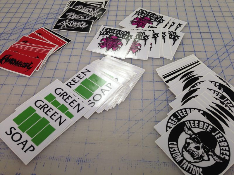
The accurate color use in your commercial signage design is vital. It is common for people to saturate their designs with too many colors or the wrong choice of combinations. Avoid using more than 3 colors and try to keep combinations simple. Also, when selecting, try to keep in mind your brand, mission, and goals. It is also important to choose colors that make the signage readable.
Color contrast is essential in order to make sure of its readability. So selecting colors based on the information and graphics you will be displaying is very important. According to the Advertising Association of America, the most visible color combinations on signs are, white on blue, black on white, black on yellow, and yellow on black. This will give you a good place to start.
Following these simple tips could get you on the right track to design the best commercial signage for your business. However, as you can see it is not an easy task and requires expertise, skills, and knowledge. Contact Summit Customs today and learn more about commercial signage and the best options for your project.


