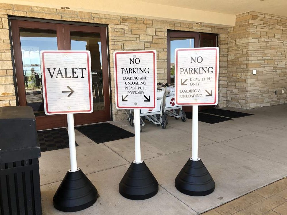
When creating or launching a new business, there are so many aspects, factors, tasks and elements to go through that is quite easy to leave important elements out. After working directly with Colorado business owners, at Summit Customs we have noticed, that many commercial shops, building or venues lack effective wayfinding signs.
It is common for large shops or venue owners to overlook wayfinding signs, creating a negative experience for customers, partners and staff navigating through their property. Wayfinding signage is used to guide people who are in unfamiliar surroundings to their particular destination, whether that be at a sport center, entertainment venue, work office or medical facility. This way, business owners or managers, can ensure to provide a familiar and cozy experience to visitors. Otherwise, they can easily feel lost and frustrated. These feelings can interfere in your final goals, especially large retail shops.
Creating effective wayfinding signs
At Summit Customs we have been working with ADA and wayfinding signs for decades. We know first hand how important is to design these sign types correctly in order to provide a safe and comfortable experience to customers and visitors, which will in the end translate into profits for your business. Here are some handy suggestions to consider when designing wayfinding signs.
Get to know your own space
Many business owners are so used to their working area, that they don’t pay attention to their surroundings at all. It is essential to walk around your building, taking notes of all the areas you want to lead people to. Consider everything from meeting rooms to bathrooms or security areas.
In case of large areas consider the possibility of adding the distance between point A to point B. This information can help people find specific rooms or departments.
Be consistent

Consistency is vital in wayfinding signs.
If you are directing a particular audience to specific areas, or classifying departments or services by colors, it is essential to be consistent with your color and graphics selection. The size, location, and shape of your sign is also to keep consistent. Also, avoid using different names for the same location.
Keep it simple: Avoid getting high on creativity. Wayfinding signs are designed to properly inform your staff, guests and customers where to find what they are searching for. Using simple fonts, contrasting colors and avoid overcrowding the sign.
Simple and universal images and graphics are extremely useful, such as handicap, men or women’s bathrooms, or simple right, left, forward and back arrows.
Take advantage and brand
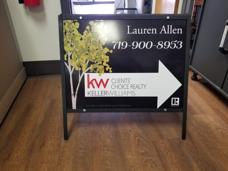
Now, just because the rule says to keep it simple it doesn’t mean you can’t take advantage of the sign to brand your business. Using the same colors of your brand on the signs, or placing your logo on all of the wayfinding signs you have can be extremely useful to create awareness.
It is always best to get help from the sign experts in Colorado. Contact Summit Customs today, and get oriented on your wayfinding signage selection.


